This post was originally published on Fast Company.
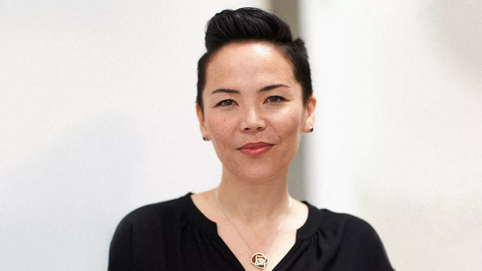
Kat Holmes shares the biggest misconceptions with inclusive design–and what companies need to do to get it right.
Inclusivity. It’s one of the biggest buzzwords inside corporations right now. But the person who brought the practice of inclusive design to Microsoft–Kat Holmes–isn’t so sure that companies really get the idea yet.
Holmes has since founded an independent design practice focused on inclusive product developing, become a judge for our 2018 Innovation by Design Awards, and penned the upcoming book Mismatch. I interviewed Holmes in a frank conversation about my own confusion, and at times, even skepticism, regarding inclusive design as a salve for many of the world’s challenges. And what she taught me should be required reading for anyone tackling the broad topic of inclusivity in design–or business at large–today.
Fast Company: So I very much believe in the grander idea of inclusive design–that by designing products through the lens of edge cases like disabilities first, they can often become better products for everyone. But lately, I’ve been wondering, does it make sense all the time? And has it been co-opted as a meaningless marketing phrase before it got off the ground? I’ve become a bit more skeptical in the last year, and I don’t even know how to bring that up to people.
Kat Holmes: Like, you’re a jerk if you don’t like inclusivity!
FC: Exactly!
KH: That’s something I’ve had to contend with. The thing I’ve seen is that the word “inclusion” means a lot of different things to a lot of different people, but there’s been a wholesale agreement that it’s a good thing. However, there’s been very little discourse on what we actually mean by it.
You get people using the word and not always having the true intentions behind it. The Olympics and Paralympics were full of advertisements that highlighted demonstrations toward inclusion, but you look at what the companies are actually doing, and inclusion is not a core value.
What inclusion means can be mistaken. Being inclusive can be mistaken for being thoughtful, or just using appropriate language. The word is elevated so quickly in a corporate sense, it’s a good time to have discourse in what we mean by it.
FC: Okay, so what do you mean by “inclusive design”?
KH: The first thing I had to contend with was, I’d been using inclusion through the lens of disability. Thinking of people with disabilities, then, how we made things fit for them. But I met a lot of people who are working on gender-related projects or race-related projects saying, “This is inclusive design,” and I couldn’t wrap my head around how all of those things are part of the same design practice.
I took a look at the words “inclusive” and “exclusive,” and the root of both is claudere. It’s Latin for “to shut.” Exclude is to shut out. Include is to shut in. Thinking of that mental model, of ingroups and outgroups, I thought maybe there’s something wrong with the mental model in our language.
In my book, I ended up writing about exclusion first, because everyone, universally, says it’s the same thing. What is exclusion? It’s when you’re left out! Exclusion became the sharp point that allowed me to talk about inclusion.
I’ve now evolved my thinking to consider exclusion as a specific way to embody inclusive design. That may be as close as we get to a definition.
FC: So instead of creating inclusive design practices, because that’s so vague, we should start by eliminating exclusive design?
KH: Yeah. Because the thing with inclusive design, and the nuance that doesn’t come through, is that it was always about including excluded communities in the design process–not marketing to people with disabilities. It’s not, you’ve designed something for a female population, and therefore it’s inclusive. It’s, did you involve someone in your design process who was previously unable to participate? How you get there is what makes it inclusive, not that it’s targeted at an underrepresented or underserved community.
FC: You know, when I think about inclusive design, I always think about those perfect examples. The typewriter and curb cuts were both designed around disabilities, and they became a better way for anyone to record text or step off the street. That’s inclusive design! But you’re really saying that it’s not a product, it’s a process.
KH: Right. It is a challenge when we think of inclusive design as an outcome and object. Inclusive design is a process, not a result.
The nuance is, there’s no real method. When we think about inclusivity, we think it’s a good thing, but we haven’t been clear with each other how we got there, and what we expect the steps to be. That’s the real opportunity: a method, or guide to what inclusion is when you’re practicing it.
The typewriter, it works great for a huge number of people, but not great for people who don’t have hands, or use of their hands. But how the product got there was [considering the needs of a blind user]–that is the part that makes it an inclusive solution. Is it the solution for everybody? No.
FC: This brings me to something I’ve been thinking about a lot. Does inclusive design always make sense? For instance, I recently wrote about a transgender woman who had rented on Airbnb for years as a man. All of her reviews were stuck in old “he” pronouns. It was confusing to other renters, and terrible for her. There was no tool in Airbnb’s settings to fix other people’s comments. She was going to delete her account and start over when Airbnb customer service just fixed the problem by hand instead. But it made me wonder–would it actually make more sense for Airbnb to potentially complicate the platform to include settings for a very select few users? Or in this case, was it better that Airbnb just had a customer service solution ready to go instead?
KH: It’s another point of tension, the difference of being inclusive versus universal. Take the curb cut. It’s a great example of inclusive design that wasn’t universal. In the early version of those curb cuts, there was no indicator for someone who was blind that they were coming to the street corner. It was really bad! They had no indicator they were walking into the street.
The tension with universal design is how you design something that works for everyone in all scenarios, with every contingency. That’s one of the challenges of understanding inclusive design when we look at the object, saying, “This design is inclusive design.” In those cases, often what we mean is universal design.
Inclusive design works more as a verb. With Airbnb, it’s, “Did they include transgender, or people with a range of genders, in the process and draw from it different solutions?” That, to me, is the nuance of inclusive design–in this case, drawing from that expertise people have in the transgender community.
FC: Is it frustrating that so many people–even people like myself who write about inclusive design regularly–miscategorize the concept?
KH: It’s funny. You know, I had to fight really hard for the words “inclusive design” when we brought it into Microsoft. There was pressure, “Let’s call it universal design or accessibility.” I had to say, “No, this is a distinct thing. It’s a way of making that has its own set of practices.”
Now, seeing so many companies and people interested in inclusion, I couldn’t ask for better timing. The part that is a challenge, sometimes, is that companies focus on human resources first. When a company talks about inclusion, they talk about hiring practices and representation on their teams. Which is important! But tying it to work process is taking more time to internalize.
FC: Do you think the trend could go wrong, and see pushback or a dilution to inclusive design if people don’t really get it?
KH: My concern would be we exhaust the word before get to the work that needs to be done–that we’ll have inclusivity burnout before we do it.
A good analog might be sustainability as an idea that grew up to mean something. It was all the rage for a while, but it didn’t really make an impact until we got more specific about LEED certifications, and asking, “What are the types of green designs for architecture and urban planning?” It had to get specific and actionable.
The word “inclusion” has even more of a tendency to feel good than sustainability, so it’s easy for people to feel like they’re doing it just because they used the word.


